September 26, 2026
Using data to increase participation in Dollar Scholars classes
Written by Dr. Jeffrey Dickinson
Part of the core strategy of Dollar Scholars is using evidence to motivate the practices and policies that are most effective. This of course means incorporating insights from the latest peer-reviewed research. No matter what the approach, it is a core principal and taught in every economics PhD program that we must use econometrics to identify and analyze causal relationships. Simply analyzing correlations does provide sufficient evidence or confidence to motivate decision-makers and policymakers to action.
The set of tools and methods we economists use to measure and assess the impact of changes in the workplace, changes in taxes, changes in laws, changes in technology we call impact evaluation, or causal analysis. We call it causal analysis because economists are literally obsessed with finding out what things cause what other economic things. For example, evaluating whether a subsidy on electric vehicles caused a reduction in emissions.
Dollar Scholars hosted an in-person class at the Alexandria Public Library this past winter. We used these methods to help us identify the most effective locations for promoting our Dollar Scholars class with flyers. For example, if Dollar Scholars volunteers distributed flyers in Maryland for events we are going to host in Virginia, that might be money and time poorly spent. What would be more effective is to distribute flyers and conduct outreach in areas around the locations where we are planning to host classes. At its core, this is an empirical question. For a policymaker or a decision-maker in our situation, the key question was, where (and also when) do we distribute flyers in order to attract beneficiaries and participants to our Dollar Scholars events?
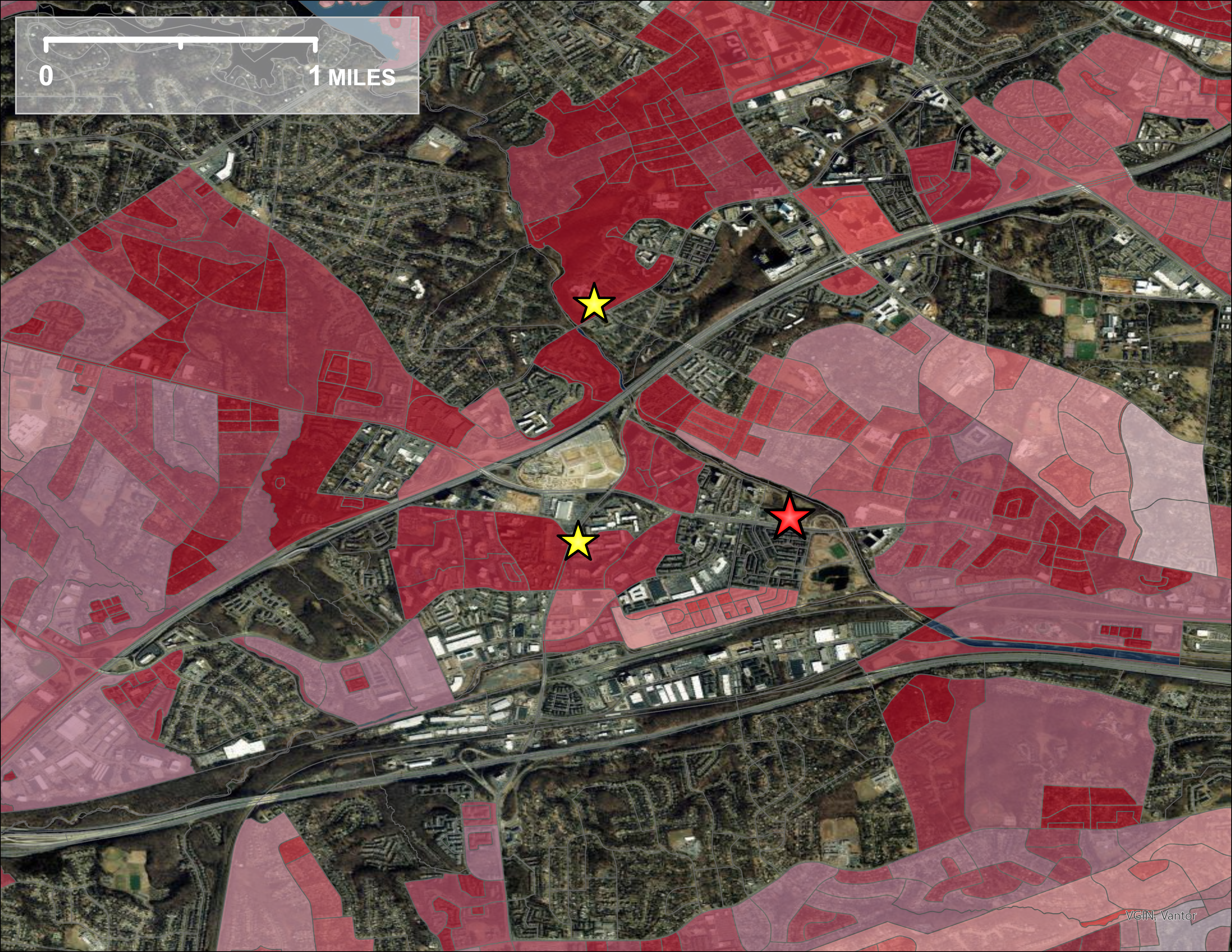
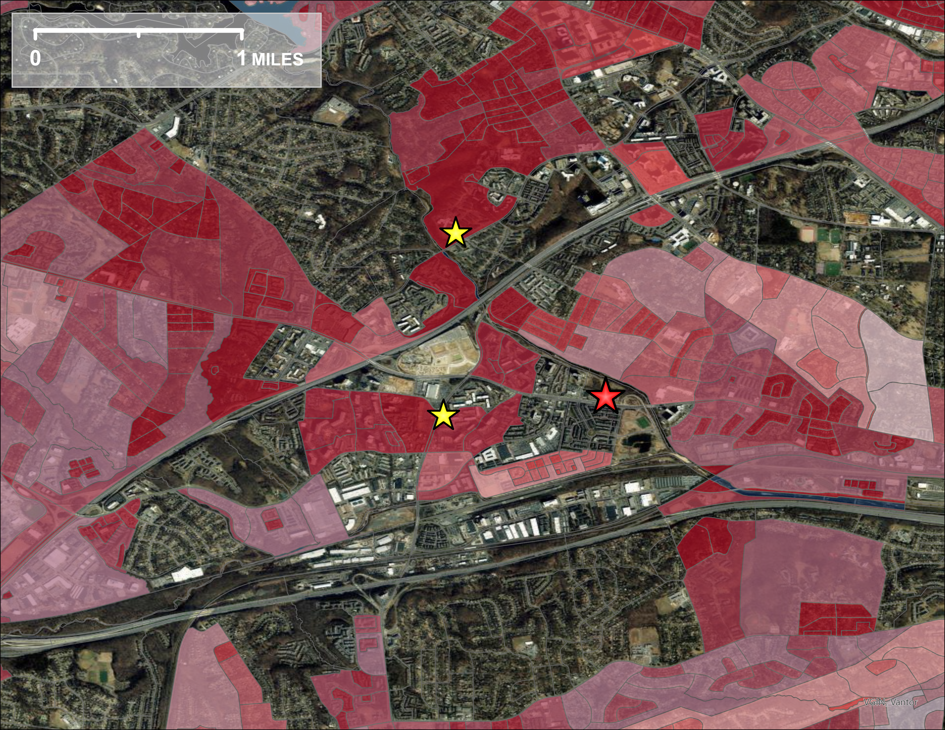
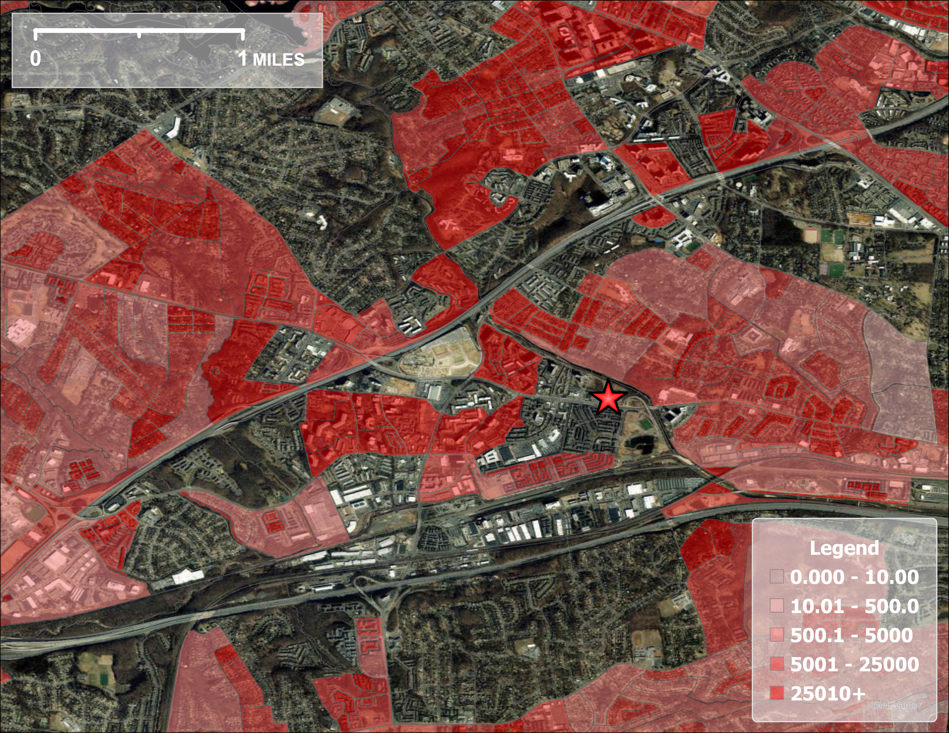
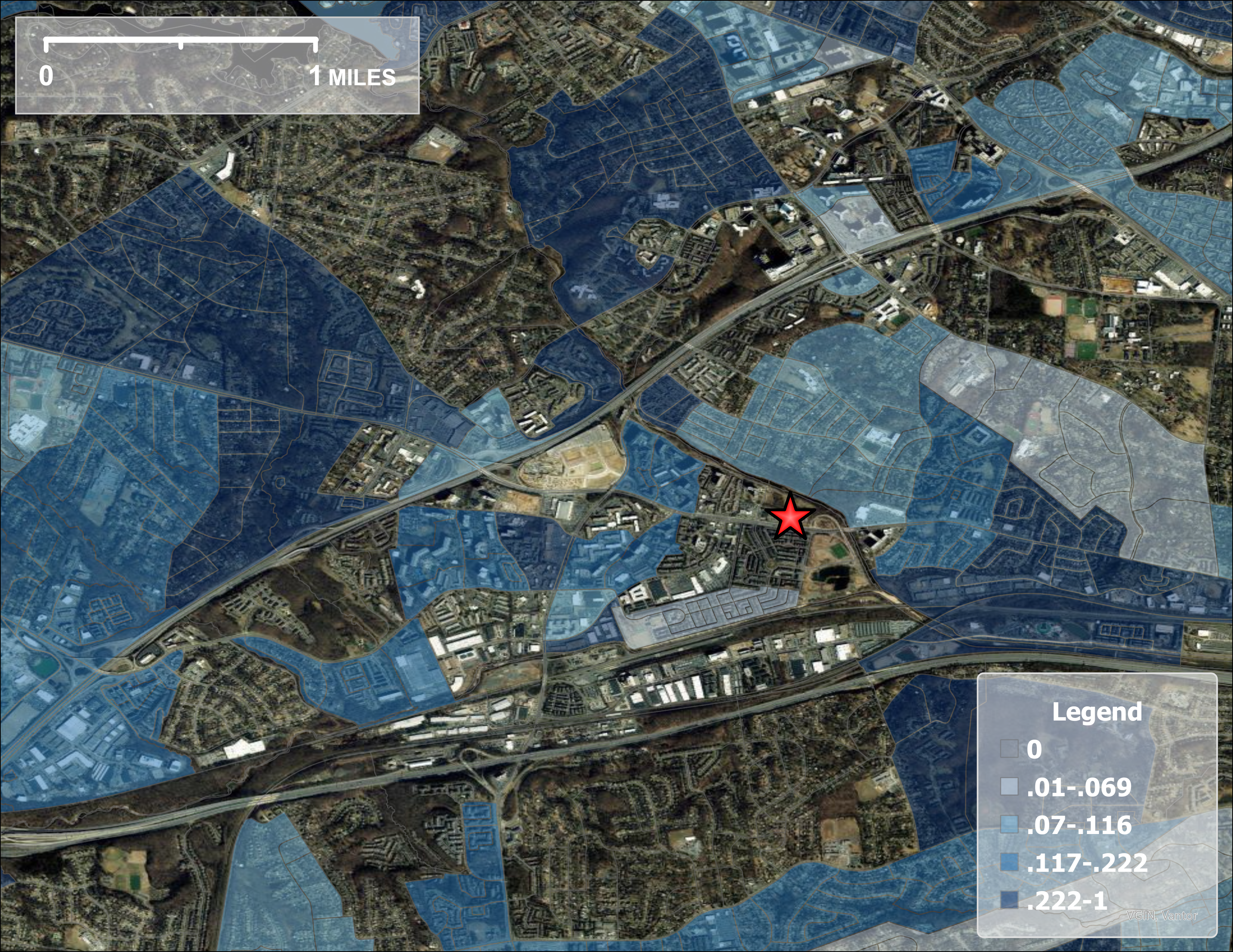
To identify the most effective areas for distributing flyers I devised a plan using 2020 U.S. Decennial Census data. The map baselayer is provided by OpenStreetMaps. On the maps, the big red star is the location of the Charles E. Beatley public library. I first mapped the density of latino persons within a particular area. Areas that are more dense with Latinos should offer better bang-for-the-buck when distributing flyers. Then I additionally mapped areas with a high proportion of latino residents. Those are two distinct things. An area could have a high density of Latinos because there's a high density of everyone, but the proportion of Latinos could still be low. For that reason I overlayed the proportion of Latinos on top of the Latino density map. See the two overlapping in figure 3, the density of Latinos is in red, and the proportion of Latinos is in blue. Areas with significant overlap are therefore dark purple. In technical terms we call this the joint distribution of Latino density and the proportion of Latinos.
Using this method we were able to identify the two neighborhoods marked with a star. Leslie and I visited those neighborhoods and distributed flyers in the days before the Dollar Scholars class. While we did not have a massive turnout, I feel sure that we used the right strategy for identifying the highest priority areas for recruiting. We will definitely use methods like this going forward to help motivate greater attendance to Dollar Scholars classes, and to get the most value out of the time and money that Dollar Scholars spends on promoting our classes.